How to Sort Data
Section three of this course is really all about charts. Later, you'll see how to create a variety of charts and chart styles with Excel. Microsoft have really revamped chart creation from Excel 2007 onwards. If you've ever used previous versions of the software, you'll appreciate how easy it is to produce impressive results.
First, though, we'll tackle the subject of how to sort data. The two subjects are not really related, but the data going in to our charts is a good opportunity to learn about this important topic.
Sorting Data in Excel 2007 to 2013
To make a start, you need to create the spreadsheet below. You don't need to use the same colours as ours, but reproduce the data and the headings exactly as they are in this one:

Our spreadsheet is all about the viewing figures for the two main TV channels in the UK. The data is a bit old, but that's not important. As long as we have some nice information to sort, that's what matters.
The viewing figures for ITV have been sorted, from the highest first to the lowest last. The BBC1 figures are still waiting to be sorted. Let's see how to do that now.
Descending Sort in Excel 2007 to 2013
We want to sort the BBC1 viewing figures in the same way that the ITV figures have been sorted. We'll put the highest programme first and the lowest last. This is called a Descending Sort. If you do it the other way round, it's known as an Ascending Sort.
The first thing to do is to highlight the information that you want to sort. In your spreadsheet, highlight cells A5 to B14. The crucial thing to remember when you want to sort data in Excel is to include the text as well as the numbers. If you don't, you'll end up with a spreadsheet where the numbers don't relate to the information, which could spell disaster in bigger spreadsheets!
Your highlighted spreadsheet, though, should look like this one:

To sort your BBC 1 viewing figures, do the following:
- From the Excel tabs at the top of the screen, click Data:

- From the Sort & Filter panel, click Sort
- A dialogue box appears:

The Sort By drop-down list seems empty. Click the down arrow to reveal the columns you selected:

We want to sort this by the values in the Millions column. So select Millions from the Sort by list.
Sort On is OK for us - it has Values. But click to see the options in the drop down list:

Values is the one you'll use the most. Once we have a Sort By and Sort On option selected, we can then move on to the Order.
Click the down arrow to see the options on the Order list:

Select Largest to Smallest. Your Sort dialogue box should then look like this:

If you clicked OK, your data would be sorted. But the level buttons at the top can come in handy. If two items in your data have the same numbers, then you can specify what to sort by next. For example, if we have two programmes that have 6.3 million viewers, we could specify that the names of the programmes be sorted alphabetically.
To do this, click the Add Level button, and you'll see some additional choices appear. You'll see the same lists as the Sort By box. If you select Column A, and then Descending, Excel will do an alphabetical sort if two items have the same viewing figures.

In the image above, we've added a "Then By" part, just in case there is a tie. You don't have to do this, as we have no numbers that are the same. Click OK to sort your data, though.
If everything went well, your sorted data should look like this:

But that's all we need to do for the sort. You can move on to creating your first chart in Excel.
Create an Excel Chart
We’re now going to create a chart from our BBC1 Viewing figures. If you haven't yet completed the sorting tutorial, go back one page and follow along with the lesson. You'll then have a some sorted viewing figures to create a chart from.
When our chart is finished, though, it will look like this:

A little later, you'll see how to improve on this basic chart.
To start making your chart, highlight the BBC1 programmes, and the viewing figures. If you have just finished the sorting section, this data should still be highlighted, and look like this:
With your programmes and the viewing figures highlighted, do this:
- From the tabs on the Excel Ribbon, click on Insert
- Locate the Charts panel. It looks like this in Excel 2007:

In later versions of Excel, the Charts panel looks like this:

For this first one, we'll create a Column Chart. So, in Excel 2007, click the down arrow on the Columnitem of the Chart Panel. You'll see a list of available charts to choose from. Select the first one, the chart highlighted below (2D Column):

The Column drop down list in later versions of Excel looks like this:

When you make your selection, a new chart appears on the same spreadsheet that you have open. The chart should look the same as the one at the top if this page.
But notice that the Excel Ribbon has changed. The design menu is selected, along with options for Chart Layouts:

In Excel 2013, you'll see these layouts on the left, in the Chart Layouts panel, under Quick Layouts:

Also on the Design Ribbon, you'll see options for Chart styles:


You'll see how to use these later. For now, your chart may be covering your viewing figures.
How to Move and Resize a Chart
You might find that your chart from the previous lesson is covering your data. In the image below, our chart is overlapping the ITV data. To move it, hold your mouse over the chart until your cursor changes shape: (We found that the best place for your mouse is over the dots in Excel 2007, as we had problems moving a chart when the cursor was anywhere else! Moving charts in later versions of Excel is easier.)

Press and hold down the mouse button when your cursor looks like the one in the image above, and then drag your chart to a new location. In the image below, we've placed the chart below the data.

You can also place your chart in a different worksheet. To do this in Excel 2007, right click anywhere on your chart. From the menu, select Move Chart:

In Excel 2010 and 2013 there is a Location panel to the right of Chart Styles. Click theMove Chart item:
In all versions, you'll then get a dialogue box popping up:

If you want your chart in a new worksheet, select the first option. Then delete the text "Chart1" from the textbox, and then type a name of your own.
If you look along the bottom of Excel , you'll see Sheet1, Sheet2, and Sheet3. Your data is in Sheet1. If you click the drop down list to the right of Object in on the dialogue box above, you'll see the other worksheets you have open. You can select one from the list and click OK. But for this first chart, leave it in Sheet1.
How to Resize an Excel Chart
You can resize a chart, and any elements on it, by moving your mouse over the sizing handles. For the chart itself, the sizing handles are the dots around the edges of the chart in Excel 2007:

In later versions, the sizing handles are white squares:

When your mouse changes shape to a double-headed arrow, hold down your left mouse button. Then drag to a new location. You can resize using the corners, or the edges..
Chart Styles and Chart Layouts
You can easily change the Style of your chart. If you can't see the Styles, click anywhere on your chart to select it, and you should see the Ribbon change. The Styles will look like this in Excel 2007:
In later versions of Excel, your Chart Styles will look like this:
Click on any chart style, and your chart will change. To see more styles, click the arrows to the right of the Chart Styles panel:

You'll then see a drop down sheet of new styles (Excel 2007):

And here's the Styles in Excel 2013:

Work your way through the Styles, and click on each one in turn. Watch what happens to your chart when you select a style.
Chart Layouts
You can also change the layout of your chart in the same way. Locate the Chart Layout panel on theDesign tab of the Excel Ribbon bar. It looks like this in Excel 2007:
In later versions you may have to click the Quick Layout option on the Chart Layouts panel:
Click the down arrow to the right of the Chart Layouts panel to see the available layouts you can choose from:

Again, click on each one in turn and see what happens to your chart. In the image below, we've gone for Layout 10:

Changing the Chart Type - 2D Bar Charts
You can change the type of chart, as well. Instead of having a 2D column chart, as above, you can have a 2D bar chart. To change the chart type, locate the Type panel on the Excel Ribbon bar (you need to have your chart selected to see it):


Then click Change Chart Type. You'll see a dialogue box appear. This one is from Excel 2007:

The dialogue box looks slightly different in Excel 2013:

Select Bar from the list on the left of the dialogue box, and click on the first Bar chart (Clustered Bar). Click OK to see your chart change:

You can experiment with the types of chart in the dialogue box. But reset it to Bar chart, as above.
The Chart Title and Series Title
Your chart from the previous section should now look like this:
Once you have your chart in place, there are plenty of formatting options in Excel. In the chart above, for example, the title says "Chart Title". And there's a not terribly descriptive orange square that says "Series 1" (your bars may be blue). We'll see how to change that in a moment. But first, the Chart Title. (If you don't have a title in Excel 2010, select the first layout in the Chart Layouts panel.)
How to Change the Chart Title
To change the title of your chart, click on the title to select it:
The circles surrounding the title tell you that it is selected. Once the title is selected, click on the letter "C" of Chart. Hold your left mouse button down and highlight the two words, as in the image below:
Once your title is highlighted, you can change it by simply typing a new one:
While the title is highlighted, you can select a different font and font size, if you want (on the Home panel in the Excel Ribbon at the top.)
To deselect the title, click anywhere outside of it.
Formatting a Series Title
To change the Series 1 text on the Chart heading to something more descriptive, select the title as you did above:
Make sure the circles are there, and then right click. You should see the following menu appear in Excel 2007:

Click on "Edit data source". Alternatively, click the Edit data source item on the Datapanel on the Excel 2007 Ribbon:

For Excel 2010 and 2013 users, your menu looks like this:

The item to click on the menu above will say Select Data instead of Edit Data Source.
In both versions you should then see the following dialogue box appear.

The Chart Data Range at the top of the dialogue box is highlighting the cells A5 to B14. This is the data we selected for the chart. Below this there is an area forLegend Entries (Series) and Horizontal Axis Labels. We'll see more of these later. For now though, we just want to change Series 1 into something more descriptive.
So click on Series 1 to highlight it. Then click the Edit button, as in the image below:

When you click the Edit button, you'll see a new dialogue box appear - Edit Series. It should look like this:

Notice the cells being referenced in the Series name area. They are cells A5 to B14. These same cells are also highlighted on the spreadsheet:

Click on the BBC title instead, the one on Row 3 above. Your Edit Series dialogue box will have changed. The Series Name area will now say A3 (amongst all those dollars):

Click OK to get back to your Edit Data Source dialogue box. The Series legend will now say BBC:

Click OK to return to your spreadsheet. But look what's happened to the chart. TheSeries 1 has gone. Next to the orange square, we now have BBC 1:
We'll meet these boxes again when we create a chart from scratch. For now, let's see some more formatting option you can do with an Excel chart.
The Chart Layout Panels
In the previous part of this lesson on charts, you saw how to format a chart with various dialogue boxes.
You can also format your charts using the menu items on the Excel Ribbon bar, at the top of the screen. With your chart selected, click the Layout menu (Not Excel 2013. See below for your Layout options). You should see this:


The Layout menu is a bit big for this page, so we've split it in two. But the chart Layout panel is split into a number of different sections (six in our version), and allows you to change the information in the chart.
For Excel 2013 users, your Layout options are on the Design tab still, on the far left, just under the File menu:

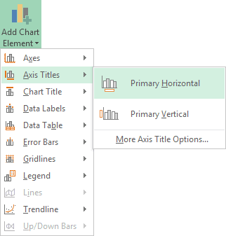
Click Add Chart Element to see th efollowing drop down list:

For all versions of Excel, The first thing you may want to do is to give your chart a name.
To change the name of your chart in Excel versions 2007 and 2010, locate theProperties panel on the Layout menu:

Highlight the default name in the textbox and type a new one:

If you now click away from your chart, and then click back on it, you'll notice the name of the chart change:
For Excel 2013 users, locate the Name box just below Chart Layouts:

Highlight the default Chart 1. Type a new name (BBC 1) and press enter:

The Labels Panel in Excel 2007/2010
The Labels panel on the Layout menu lets you format the titles and legends on your chart. Here it is:

Or this for Excel 2013 users:
The first one is Chart Title. Click the arrow to see the options:


Click each item on the menu in turn to see what they do. Then click More Title Options. The following dialogue box will appear (Excel 2010 has more options. Excel 2013 users, see below for your options.):

As you can see, there are options to change the Fill, Line, Line Style, Shadow, 3-D format, and Alignment. Play around with the options on the dialogue box to see what they do. The only thing you're changing here is the Chart Tile. Click Close when you're done. If you don't like what you see, click the undo arrow at the top of Excel.
Formatting Chart Titles in Excel 2013
Excel 2013 users won't see a dialogue box. Instead, you'll see a panel appear on the right of the screen. This one:

Click an arrow to see further options. Here are the options for Fill:

You can also click the icons at the top. There are three of them: a paint bucket, an Hexagon, and a resize symbol.
Click the Hexagon and you'll see these options:

Click the Rezise symbol and the options will change to these:

As well as the three symbols, you can click the Text Options, you to the right of Title Options at the top. You'll then see even more options, this time to change the text itself:

Play around with all and see how they work.
Change the Axis Title in Excel 2007/2010
The next item on the Labels panel is the Axis Title. Click the down arrow to see the options:

At the moment, our chart has no Axis Title. It just has numbers running across the bottom. Someone looking at the chart won't know what the numbers represent. Here's what our Chart looks like at the moment:

To add an Axis title in Excel 2007 and 2010, click on Primary Horizontal Axis Title. From the sub menu, click Title Below Axis.

In Excel 2013, select Primary Horizontal on the Axis Titles menu of Add Chart Elements:
When you click Title Below Axis or Primary Horizontal, a new title will be added to the chart:
Highlight the default text, and type your own:
Click away from the chart to see what it looks like:
We now have some explanation for what the numbers represent. You can add a Vertical Axis, as well. Click on Primary Vertical Axis Title and see how it works.
Chart Legend
The Chart's Legend is this one:
At the moment, our Legend is on the right of the chart. But you can move this. Click the Legend item on the Layout panel to see the various options:


Click an option on the menu and watch what happens to your Legend. You should see it move around your chart.
Adding Data Labels to an Excel Chart
A Data Label is information overlaid on the chart bars. In our chart below, we have numbers overlaid on the orange bars:

You can format these Data Labels. Click the Data Labels item on the Labels panel to see the following options:


The one wat we have at the moment is Inside Edge. Click on Outside End and your Data Labels will look like this:

You can also see the options if you click More Data Label Options from the menu. You'll then see this dialogue box (In Excel 2013, again, you won't see a dialogue box. Instead, you'll see the Format panel appear on the right of your screen. The same options as below will be available, however.):

Again, play around with the options to see what they do. The first two, Label Options and Number, are the ones you'll probably use most often.
The Format Chart Panel
In the previous lesson, you saw how to use the Layout panels to change the layout of the chart itself. The Format panels allow you to create some great looking charts with just a few mouse clicks.
Click on your chart to select it, and then click the Format menu at the top of the Excel Ribbon. You should see this long menu, split in two here:


Using the various Format Panels on the Excel Ribbon, we'll format our chart from this:

To this:

OK, it may look a bit gaudy! But at least it's lively. You can create a chart like this quite easily:
- First, click on your chart to highlight it
- Click the Format menu on the Excel Ribbon
- Locate the Shape Styles panel:

Click the down arrow on the right of the panel to see the available styles (there might not be so many styles in Excel 2013, so you my have to select a different colour):

When you move your mouse over a style, your chart will change automatically. But you won't be able to see the full effect until you click away from the chart. We went for Style 28, the one that's highlighted in the image above. You get the rounded corners, the drop shadow and the colour fill.
Create your own Chart Style in Excel
You can create all that yourself, though. If you want to create your own style, try the following:
Fill your chart with a colour by clicking the down arrow on Shape Fill on the Shape Styles panel:


Select a colour from the list. Or click "More Fill Colors". Once your chart has a colour, you can liven it up a bit.
Still on the same menu, click on Gradient. The sub menu appears:

We went for one of the Dark Variations.
Next, you can spruce up the text on your chart. Locate the WordArt Styles panel:

Click the Text Fill button to see the available colours:

Once you have the chart background and text formatted the way you want it, you can add some rounded corners, and a bit of drop shadow. You can apply both of those from the Format Chart Area dialogue box. Here's how.
To bring up the Format Chart Area dialogue box, click the Format Selection button on the Current Selection panel:

You'll then see the following dialogue box appea (If you're using Excel 2013, you'll see a panel appear on the right of your screen instead of a dialogue box):

To get rounded corners, click on Line in Excel 2007. You'll then see the following options:

In Excel 2010, you'll have a Border Styles menu on the left. Click that to see the Rounded Corners option. For Excel 2013, click the Border category to exapand it. The Rounded Corners options is at the bottom:

Put a tick in the box for Rounded Corners.
To get a Shadow for your chart, click the Shadow option on the left of your dialogue box. The options will change to these:

For Excel 2013 users, click the Hexagon symbol at the top, just to the right of th epaint bucket:

Click the Presets button to see a list of pre-made shadows:

Select the one you like. Then click Close on the dialogue box. Your chart will then have rounded corners and a drop shadow.
OK, you should now a very smart chart. Playing around with the various options on the Format Chart Area dialogue box can really bring an Excel chart to life!
How to Create a Pie Chart in Excel
Pie charts are quite easy to create in Excel 2007 and Excel 2010. In case you're not sure what a Pie Chart is, here's the basic one you'll be creating. Later, you'll add some formatting to this:

To make a start, you need to highlight some data. If you've been following along with the previous tutorials, then you'll have some viewing figures data. You've created a 2D chart with the BBC data. This time we'll use the ITV data. If you don't have this data, create the following simple spreadsheet. The cells to use are D4 to E14:

- Click inside cell E4 and change "Millions" to ITV, if you already have the data from a previous lesson
- Highlight the cells D4 to E14
- Click the Insert menu at the top of Excel
- Locate the Chart panel, and the Pie item:

In Excel 2013, the Pie chart is harder to spot. But it's highlighted in green in the image below:

Click the down arrow and select the first Pie chart:

- A new Pie chart is inserted
- Move your new pie chart by dragging it to a new location
- Notice how all the segments of the pie chart are the same colour in Excel 2007:

To get different colours, make sure that your chart is selected and locate the Chart Style panel:

Click the down arrow to the right of the Chart Style panel to reveal the available styles :

We've gone for the second one, Style two. If you haven't got this style, select a similar one, such as style 4 in Excel 2013. The chart will then look like this (your labels may well be at the bottom, though, depending on which version of Excel you have):
But it looks pretty good for just a few mouse clicks! We can still do a bit more to it, though. Now, you'll see how to add the viewing figures to the pie chart segments.
Add Data Labels to a Pie Chart
In the previous tutorial, you created an Excel Pie Chart that looks something like this:
At the moment, though, there's no information about what each segment represents. We're going to add the numbers from our ITV viewing figures. These ones:
To add the numbers from our E column (the viewing figures), left click on the pie chart itself to select it:

The chart is selected when you can see all those blue circles surrounding it. Now right click the chart. You should get the following menu:


From the menu, select Add Data Labels. New data labels will then appear on your chart:

The values are in percentages in Excel 2007, however. To change this, right click your chart again. From the menu, select Format Data Labels:

When you click Format Data Labels , you should get a dialogue box. This one:

If there's a tick in Percentage, untick this and select Value:

Your chart will then have the correct numbers:

Overall, the chart looks OK. But we can add some formatting to it.
How to Format Pie Chart segments
From the previous lesson, your Pie Chart segements look like this:
You can change the colour of each slice of your pie chart, and even move a slice. Let's change the colours first.
Change the Colour of a Pie Chart Segement
Left click on the pie chart itself to select it:
It is selected when you can see those round handles. Now left click on one of the segments to select just that individual slice. It's a little bit tricky, but if you do it right your pie chart should look like this:

In the image above, only the 10.99 segment is selected. You should see round circles surrounding just that segment. Now right click your segment and, from the menu that appears, select Format Data Point:

You should see the following dialogue box appears (you'll see a panel appear on the right of your screen in Excel 2013. The same options will be available as the ones below, however):

Click on Fill from the options on the left (Excel 2013 user should click the paint bucket icon at the top, then click to expand the Fill option). The dialogue box changes to this:

There are quite a lot of options to experiment with. But select the Solid Fill option:

Now click the colour picker, and choose a new colour for the segment:

We've gone for a dark orange colour, but select any colour you like.
Move a Pie Chart Segement in Excel
To move the slice that you've just coloured, click back on Series Options from the options on the left:
In Excel 2013, click the three bars icon:

Set the Point Explosion slider to about 30%

Now click the Close button. Your chart should look something like this one:

Change the rest of the slices in exactly the same way.
Create a 2D Line Chart in Excel
For this last chart, we'll compare the viewing figures of BBC1 and ITV. A line chart is better for this type of data. The chart we'll create looks like this:

We're comparing how many hours per week a person watches BBC1 with how many hours they watch ITV. You'll need some data, of course. Start a new spreadsheet and enter the same data as below:

Once you have your spreadsheet data, highlight the cells A3 to H5. Now click Insert from the Excel Ribbon bar. Locate the Charts panel, and click on Other Charts. From the menu, select All Chart Types (In Excel 2013, there is no Other Charts option. See below for what you should do):

In Excel 2013, click the Recommended Charts item instead of Other Charts:

When you click All Chart Types, you'll get a dialogue box popping up (Excel 2013 users shoudl click the All Charts tab on their dialogue box):

From the dialogue box, the left hand side shows all the chart templates. Click on Line. Select the first Line chart, the one highlighted in the image above. Click OK and Excel will insert your chart. It should look like this:

The chart looks a bit plain, at the moment. You can change the colour of the lines for BBC and ITV. Locate the Chart Styles panel on the Design menu:

Click the down arrow on the right of the Chart Styles panel to reveal the available styles:

We've gone for the first one, top left. When you select a style, your chart will change:

The lines are more distinct now. The dates at the bottom don't look too impressive, though!
Format Axis Titles
From the previous lesson, your 2D Excel Line Chart should look like this:
To format the dates on the bottom Axis, click on them with your left mouse button. With the dates Axis selected, right click. You should see this menu:

Select Format Axis from the menu, and you'll see the following dialogue box appear (Excel 2013 users will see a panel appear on the right of the screen, instead of a dialogue box):

Under Axis Type, select Text Axis:

Your dates should end up in the middle. (Our version of Excel was a little buggy. We had to click Date axis, then click back on Text axis to get the dates in the middle.)

Adding an Axis Title
To add an Axis label at the top of your chart, if you have Excel 2007 or Excel 2010, click the Layout menu at the top of Excel. Then locate the Labels panel:

Click on Chart Title. From the menu, select Above Chart:

If you have Excel 2013, however, stay on the Design Ribbon and locate the Chart Layouts panel on the left, just under the File menu. Click Add Chart Element, thenChart Title > Above Chart:

You will then see a default title appear at the top of the chart. Highlight the text, and type a title of your own:

Add a Left Axis
We now need to add an Axis for the numbers running up the left of the chart. The numbers are the hours per week that people watch each channel - 0 to 6.
From the Labels menu still, select Axis Titles > Primary Vertical Axis Title > Rotated Title:


(Excel users won't have Rotated Title option - the title will roate by itself.)
This will add a title like the following one:

Highlight the default title and type Hours. You can move the title to the left by clicking and dragging. This is a little tricky, though! Use the Zoom tool at the bottom of Excel to zoom in on your target:
Move the Axis in to position:

When you're done, your chart should now look like this one:

Spruce it up a bit by adding a bit of fill colour, rounded edges, and shadow. You've already done this previously, so we won't go through it again. When you're done, it may look like ours:
And that's it for line charts. If you've been following along from the beginning, you should now have some impressive Excel chart skills.
Predicting future values with Excel Charts
Excel can help you make predictions about future values, or help you spot a linear trend. What we'll do in this section is set up something called a Trendline. We'll use an X, Y Scatter chart for this. We'll take a look at future income predictions based on what was earned in previous years. If you're a bit confused, don't worry: it will all become clear as we go along.
Type the following headings into cells A1 to C1:
Year Years since 2006 Income
Format the cells, if you prefer. Your spreadsheet will then look like this:

Enter the years 2006 to 2019 into cells A2 to A15:

As an X axis for our chart, we can have the years since 2006. These values will be used in a later formula. In Cells B2 to B15 enter the values 0 to 13:

We now need some income values for the years 2006 to 2013. This is income that has actually been earned, rather than income that might be earned in the future. We'll then use this hard data to predict future values. Enter some income values, then, into cells C2 to C9. We made up the following values:

We're now ready to insert an X, Y Scatter chart.
Highlight the cells B1 to C9:

This will be the data for our chart.
From the top of Excel, click on the Insert ribbon. From the Charts panel, locate and click on the Scatter charter icon. The icon looks like this:
Select the first item to get a chart with just dots:

(If you can't see the icon above, click on Recommended Charts. Switch to the All Charts tab, then select X Y Scatter).
A new chart will then appear on your spreadsheet. It should look like this:

The figures along the bottom, the X Axis, are our years since 2006. The figures on the Y Axis are our income values. The first dot, the one on the far left, tells us that we made just over 12000 at Year 0, (Year 0 is 2006). At Year 1 (2007) we made just under 16000. At Year 2 (2008) we made just over 14000, and so on.
All these dots seem to form a loose line going up from the left. You could add a line yourself using the Shapes item on the Illustrations panel. What you'll then have done is to create a linear regression.
Rather than add the line ourselves, however, Excel can add the line for us. Not only that, it can give us the formula it used to create the line. We can use that formula to predict future incomes.
Click on your chart to highlight it. You should see three icons appear on the right, in Excel 2013. (See below for Excel 2007 and Excel 2010.) Click on the Plus symbol, and put a check in the box for Trendline:

When you check Trendline, you should see a line appear on your chart:

To get the line in Excel 2007 and 2010, select your chart then click on the Layouttab. From the Analysis panel, click the Trendline option. From the Trendline menu, select Linear Trendline.
The line represents Excel's best fit for a linear regression. It's trying to put as many as the dots as it can as close to the line as possible.
To see the equation Excel used, click on the Plus symbol again (Excel 2013). Then click on the arrow to the right of Trendline. A new menu appears. Select More Options at the bottom:

You should see a panel open on the right of Excel, like the one in the next image.
For Excel 2007 and 2010 users, Click the Layout tab again. Then click theTrendline on the Analysis panel. From the Trendline menu this time, select More Trendline Options. You'll then see a dialogue box with options the same as the ones in the image below.

The Trendline option we've chosen is Linear. Have a look at the bottom, and check the box next to Display Equation on chart.
When you check the box you should the following equation appear on your chart:
y = 564.88x + 13604
This is something called the Slope-Intercept Equation. If you remember you Math lessons from school, the equation is usually written like this (the "b" at the end may be a different letter, depending on where in the world you were taught Math):
y = mx + b
In this formula, the letter "m" is the slope (gradient) of the line, and the letter "b" is the first value on the y axis. The x is a value on the X-Axis. Once you have the slope of the line, a value for the X-Axis, and the starting point of the line, you can extend the line, and work out other values on it. This will be the letter "y" in the equation.
Excel has already worked out two values for us, the "m" and the "b". The "m" (the slope) is 564.88 and the "b" is an income value of 13604.
To work out the y values we just need an "x". The "x" for us will be those "Years since 2006" in our B column.
Click inside cell C10 on your spreadsheet, then. Enter the following:
=564.88 * B10 + 13604
Press the enter key and you should find that Excel comes up with a value of 18123.04. This is the predicated income for the year 2014. Use Autofill for the cells B11 to B15. The rest of the predicted values will then be filled in:

So Excel is predicting we'll earn 18123.04 in 2014. By 2019, it's predicting we'll earn 20947.44.
Sparklines
Sparklines are mini graphs that you can add to cells in your spreadsheet. They were introduced in Excel 2010, and look like this:

The graph in the cell A8 shows the scores that Lisa achieved in her tests. You can quickly see that Lisa's scores are going up all the time, with no dips.
To add Sparklines to your own spreadsheets, start with some data. (You need more than one value, otherwise you'll just have a dot.) In a new Excel spreadsheet, type the following exam scores:

Change the height of row 8 to create more room for the Sparklines. To do this, you can simply move your mouse to just below the number 8 on the left of Excel. When your mouse pointer changes shape, hold down the left mouse button. Keep it held down and drag to a new height.
If you want an exact value for the height, click inside of any cell on row 8. Locate theCells panel on the Home ribbon at the top of Excel:

From the Cells panel, click on Format. From the Format menu, select Row Height:

When you select Row Height, you'll see a small dialogue box appear. Type in a new value for the height and click OK:

Row 8 on your spreadsheet should now look like this:

Adding a Sparkline to a Spreadsheet Cell
To add a Sparkline, click inside of cell A8. Now select the Insert ribbon from the top of Excel. From the Insert ribbon, locate the Sparklines panel:

You can see that there are three options: Line, Column, and Win/Loss. The first two are the most used options. Click on Line and you'll see a dialogue box appear. This one:

The first text box is where you specify your Data Range. Click inside this box and enter A1:A7. For the second text box, Location Range, you specify where on your spreadsheet you want your Sparkline to appear. We want the Sparkline to appear in cell A8. The dollar signs before the A and 8 mean it will be an Absolute cell reference, as opposed to a Relative cell reference. (We go into this in more detail in a later tutorial, here: Absolute Cell References.) If you leave the Location Range box blank then your Sparkline will appear in the currently selected cell.
Your Create Sparklines dialogue box should look like this:

Don't worry if your Location Range text box is blank, though. As long as your Data Range box is filled in you can click OK.
When you do click OK, your A8 cell will look like this:
You can use AutoFill for the other exam scores. Move your mouse pointer to the bottom right of cell A8 until the pointer turns into a black cross. Hold down your left mouse button. Keep it held down and drag to cell D8. You should see all four cells fill with Sparkline charts:

You can liven up your sparklines by added markers and changing line colours. We'll do that in the next part.
Comments
Post a Comment